Tru-Vue Home | History | Viewers | Filmstrips | Cards | Boxes | Cases | Special Sets | Sales & Advertising
Tru-Vue Viewer Boxes
One thing we’ve admired most about Tru-Vue is their marketing. In 1933, they ushered in a new era of 3D viewing for the masses with a fierceness and kept their foot on the gas, beating out temporary competitors like Novelview and De Vry until they finally lost the market to Sawyer’s. We think their investment in packaging design over the years reflects their commitment to their product. Here are the various Tru-Vue boxes that have made it into our collection.
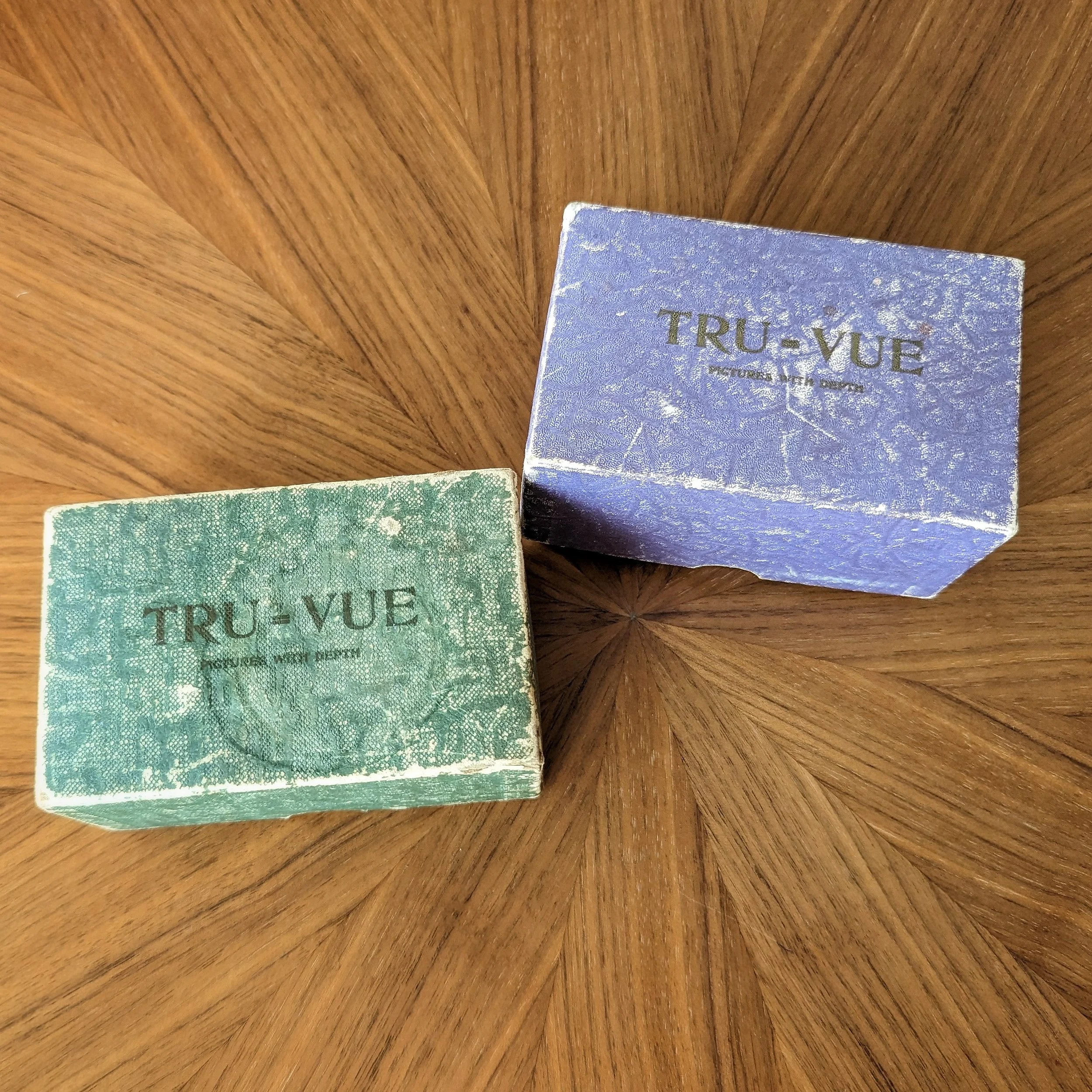
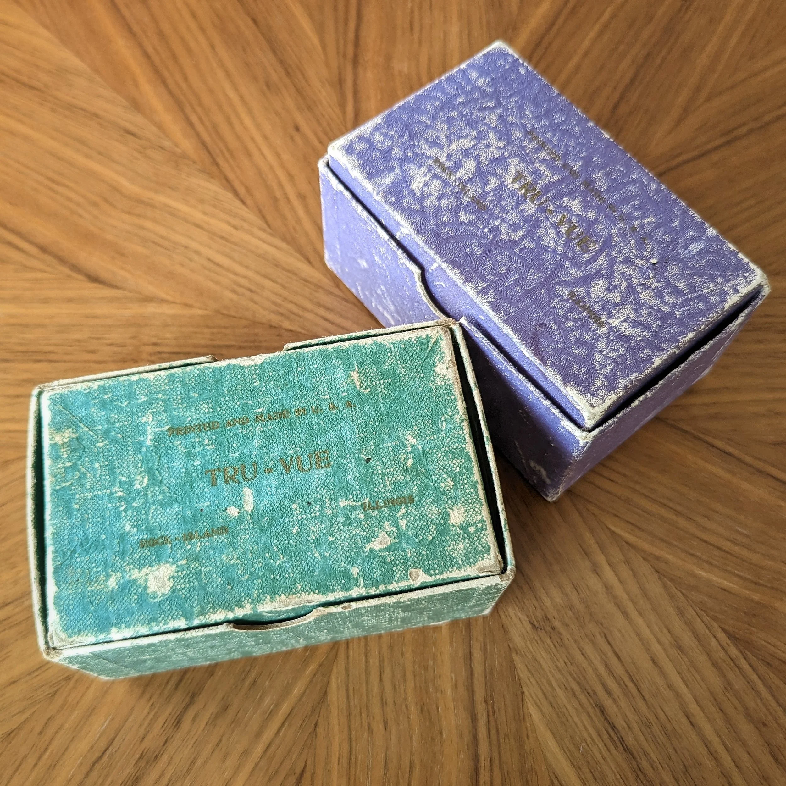
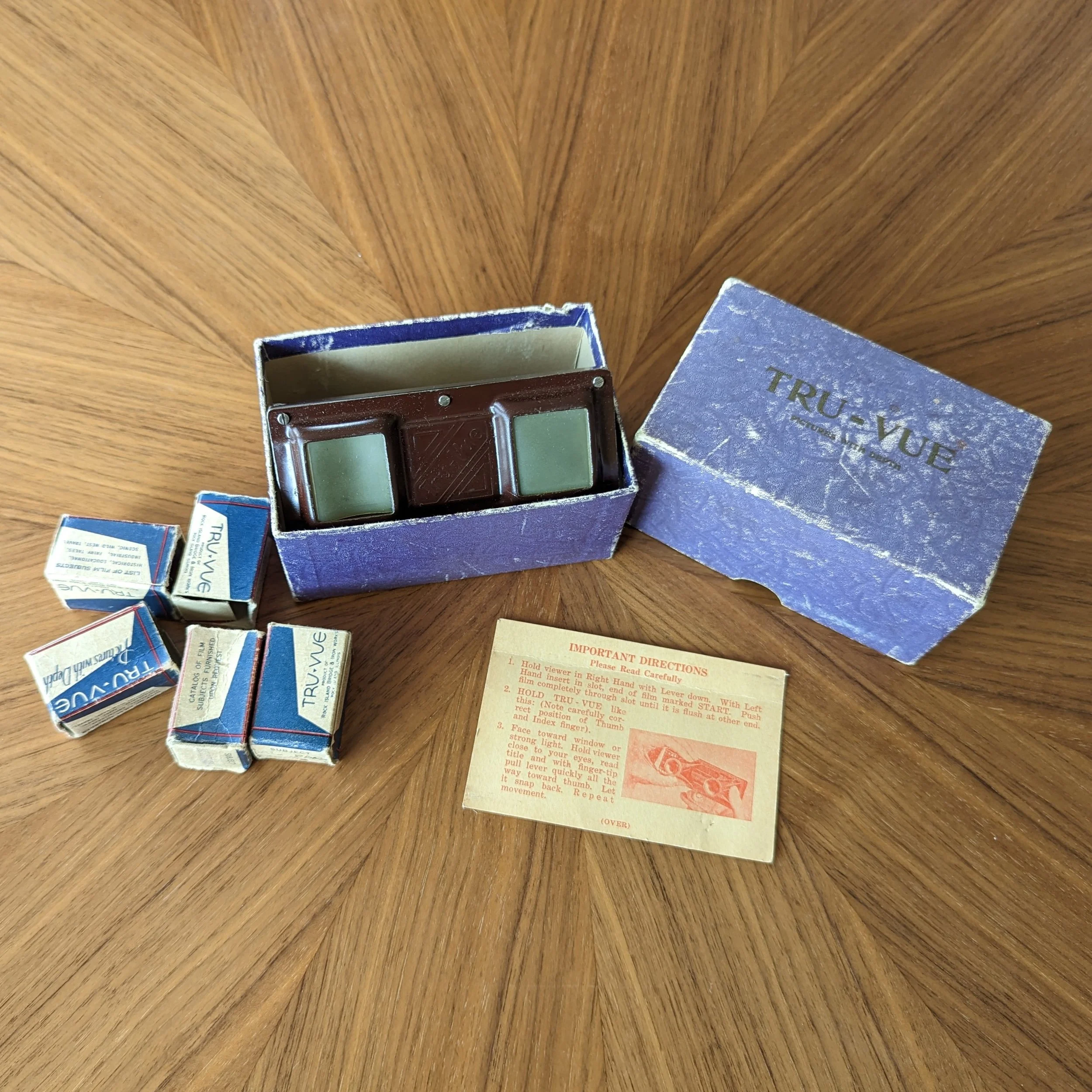
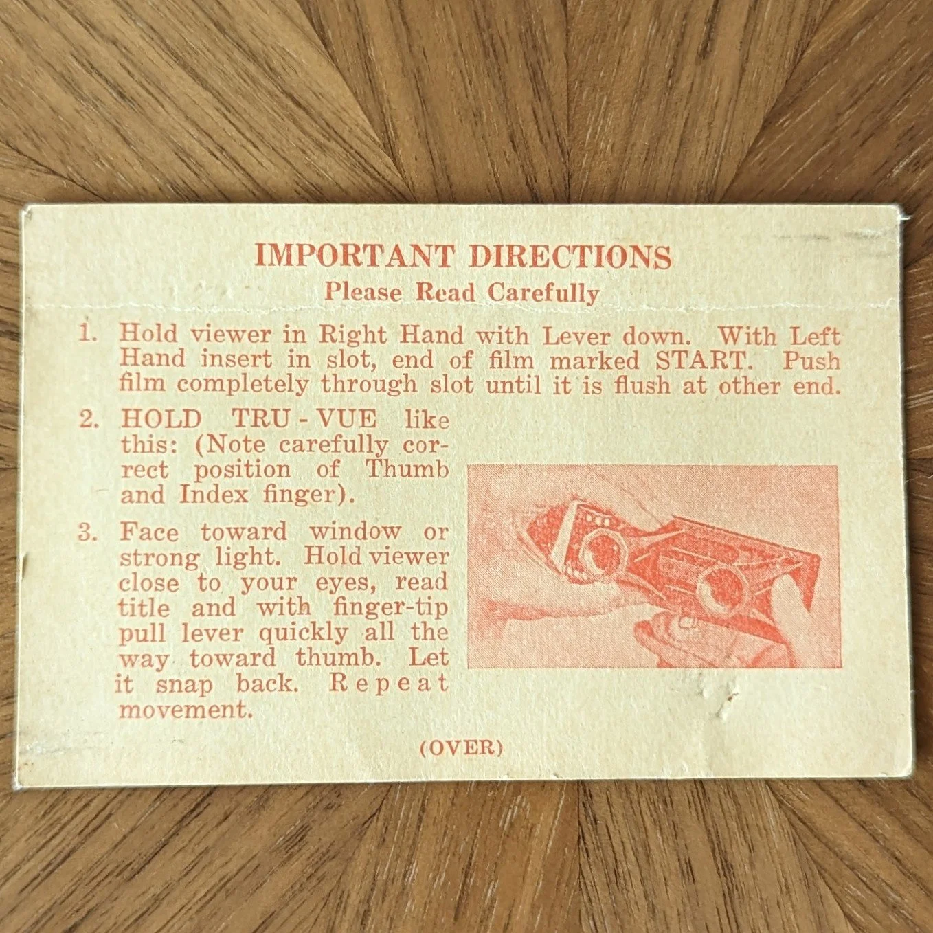
Early Viewer Boxes (1933)
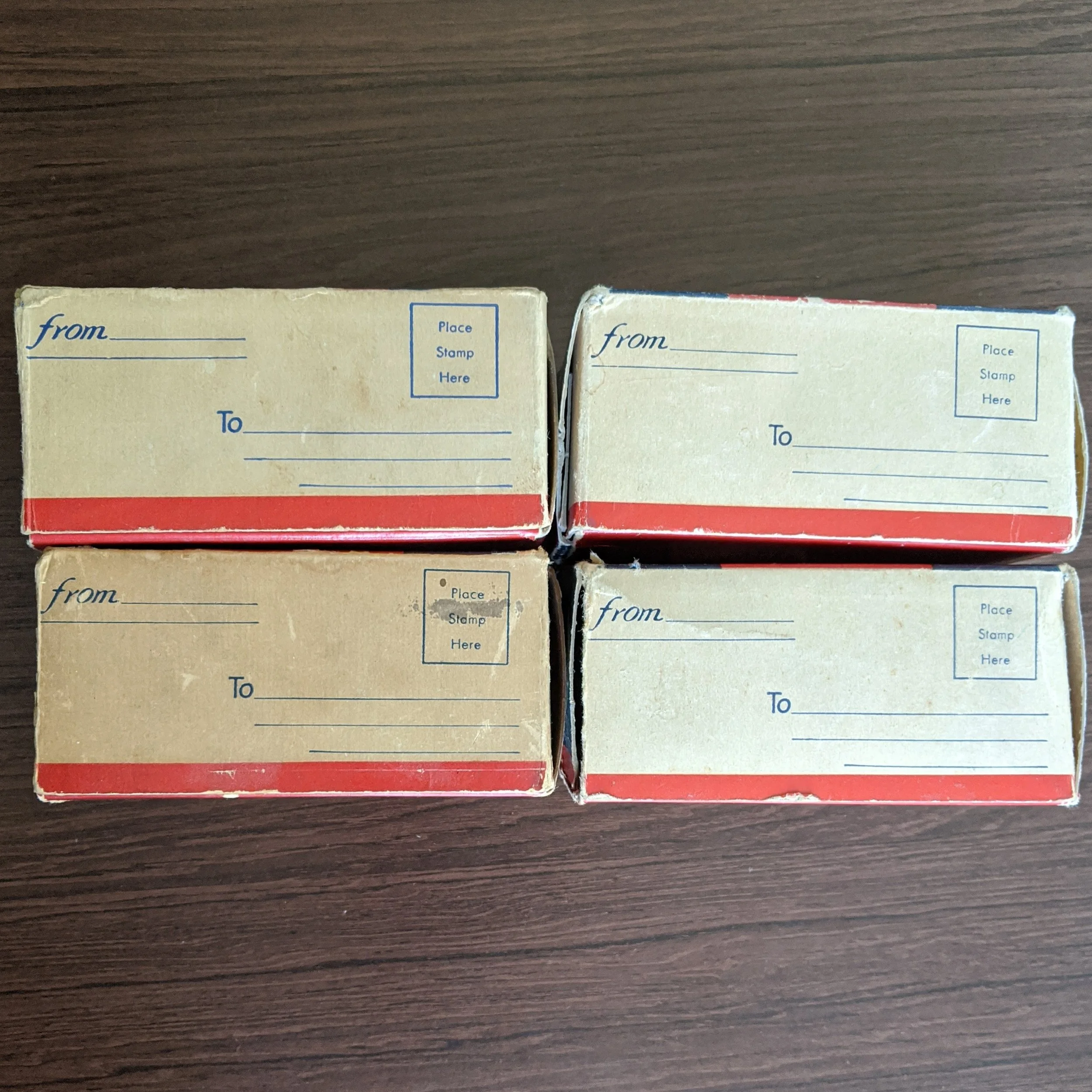
These very early Tru-Vue boxes are hard to find, but they do surface occasionally. We have them in green and purple. The Tru-Vue name and their slogan “Pictures with Depth” appear on the top of the box. Inside these boxes, we have only seen the earliest shiny faceplate Art Deco-style viewer and the very early Tru-Vue blue film boxes. Other collectors have seen an early blue viewer box with no text on the top piece, but we don’t have that version in our collection.
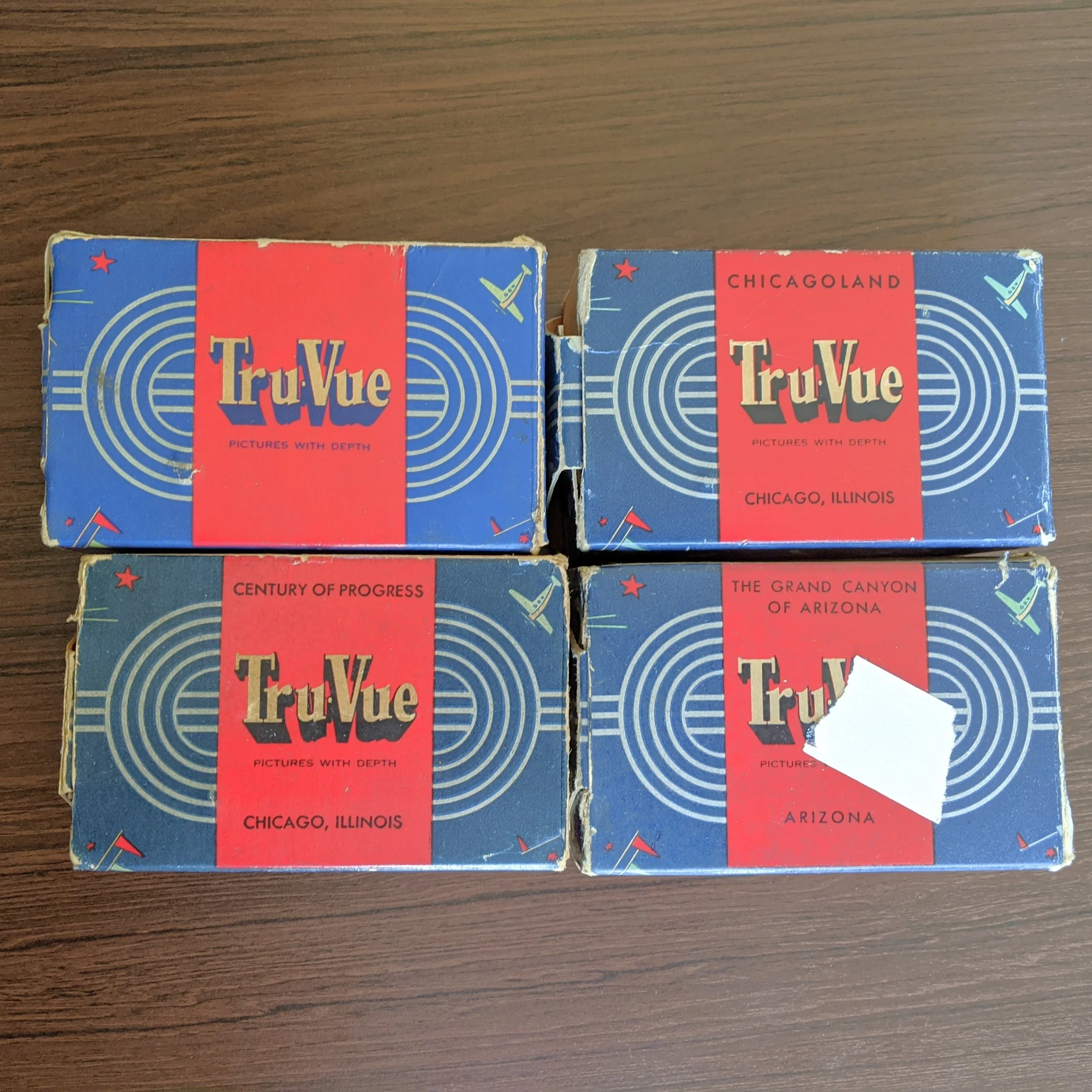
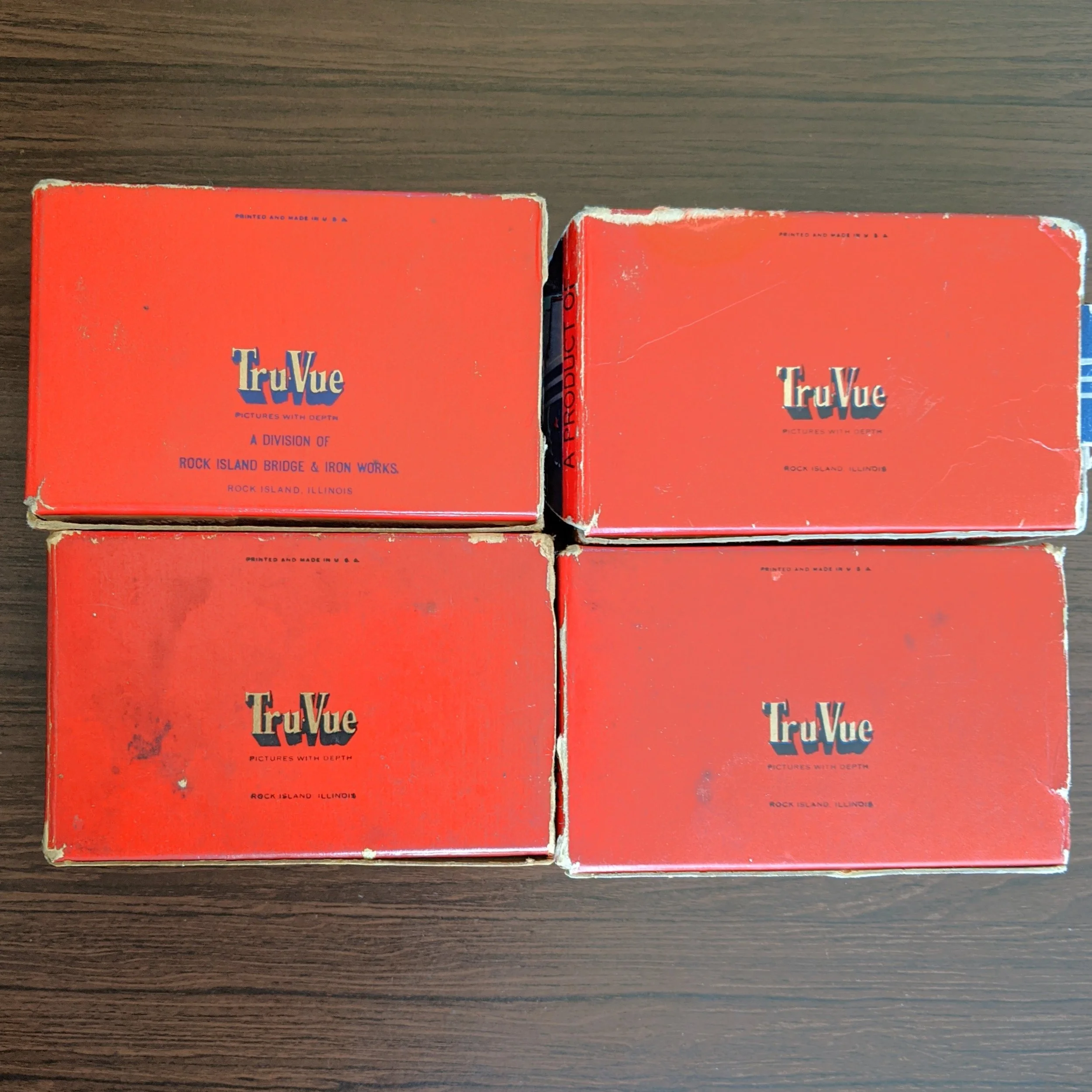
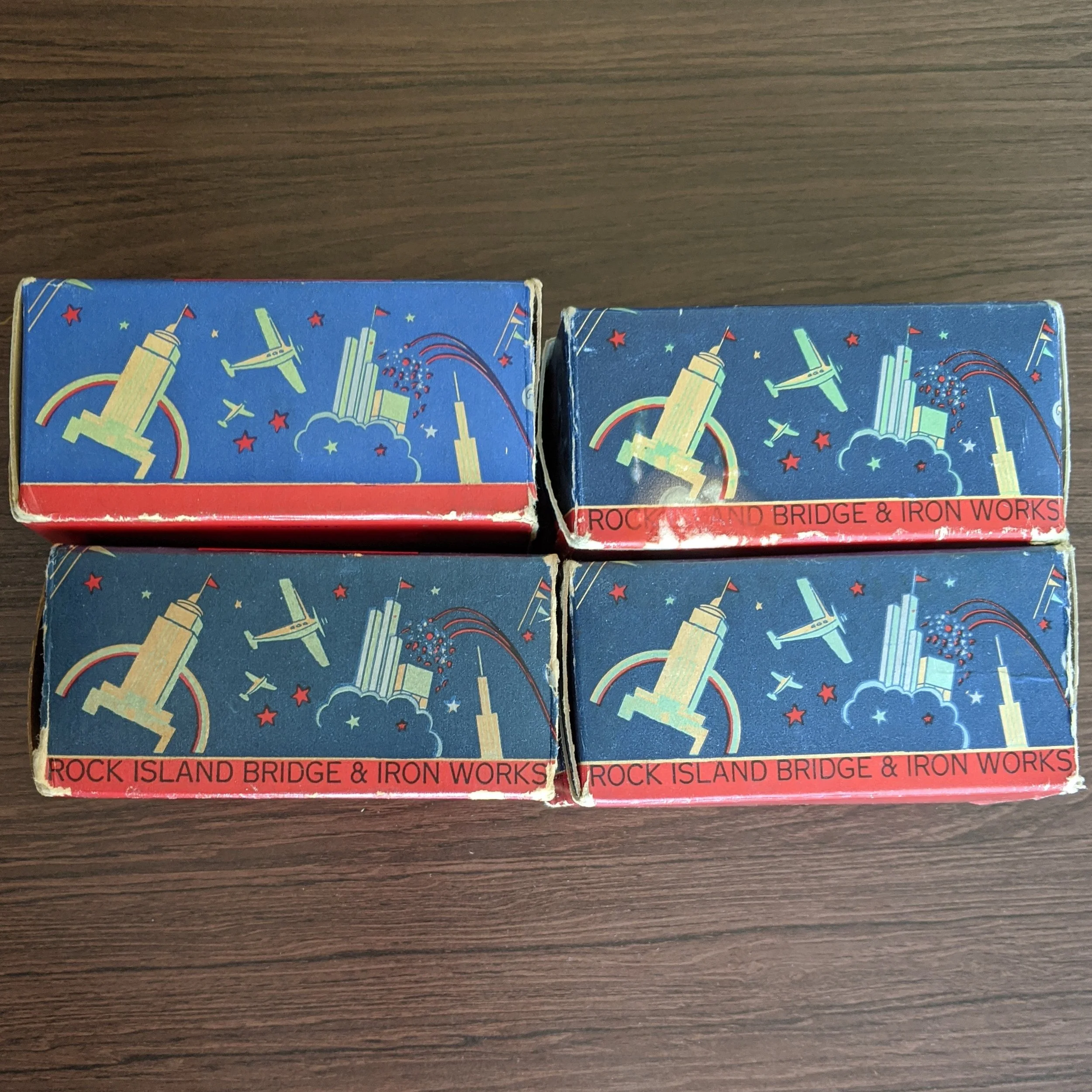
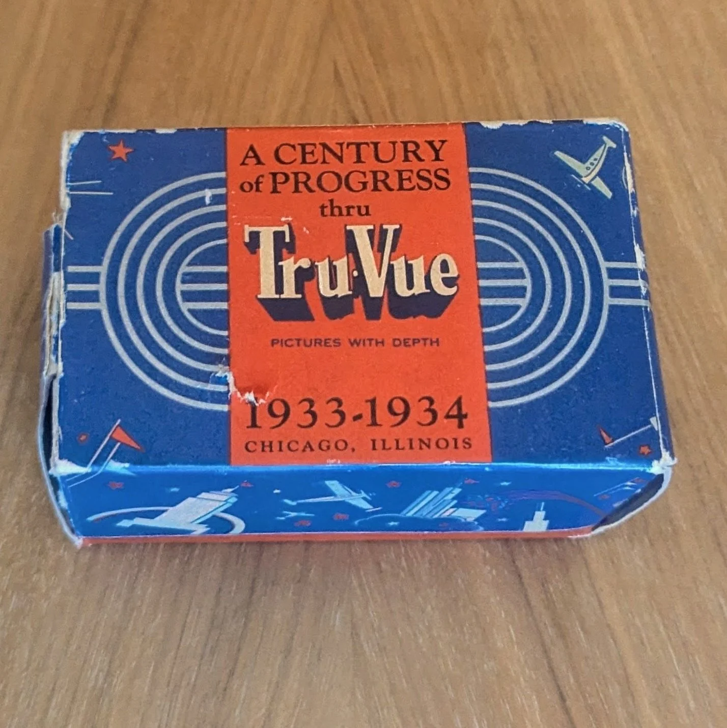
Red & Blue World’s Fair Boxes (~1933-34)
Tru-Vue made its big debut at the 1933 Century of Progress World’s Fair. To mark the occasion, they created one-piece, mailer boxes with fun World’s Fair graphics. We have 4 versions:
Plain - contained the shiny Art Deco-style viewer with the Tru-Vue logo.
Chicagoland - sold at the World’s Fair. “Chicagoland” refers to the Chicago area of Illinois.
Century of Progress - contained the shiny Art Deco-style viewer with the 1933 or 1934 Century of Progress logo.
The Grand Canyon of Arizona - sold at the Grand Canyon National Park. It contained the shiny Art Deco-style viewer with the “Made for Fred Harvey” logo. Fred Harvey was a restaurant chain that ran concessions at the Grand Canyon and other tourist spots. If you’re looking for a Fred Harvey viewer, look for this box — not the Fred Harvey boxes.
The first box mentions Tru-Vue’s connection to Rock Island Bridge & Iron Works on the bottom. The other three boxes indicate that relationship on the side, rather than the bottom.
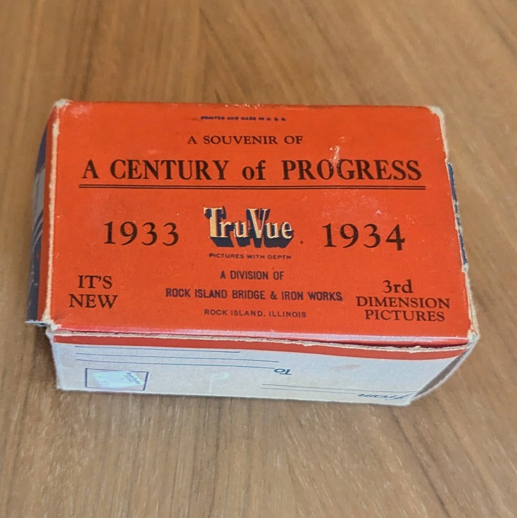
Rare World’s Fair Box
This is the only World’s Fair box we’ve seen of this type. The Century of Progress branding is much more prominent: it’s larger, it’s on both the front and back, it specifies the viewer as a souvenir of the fair, and that “it’s new.”
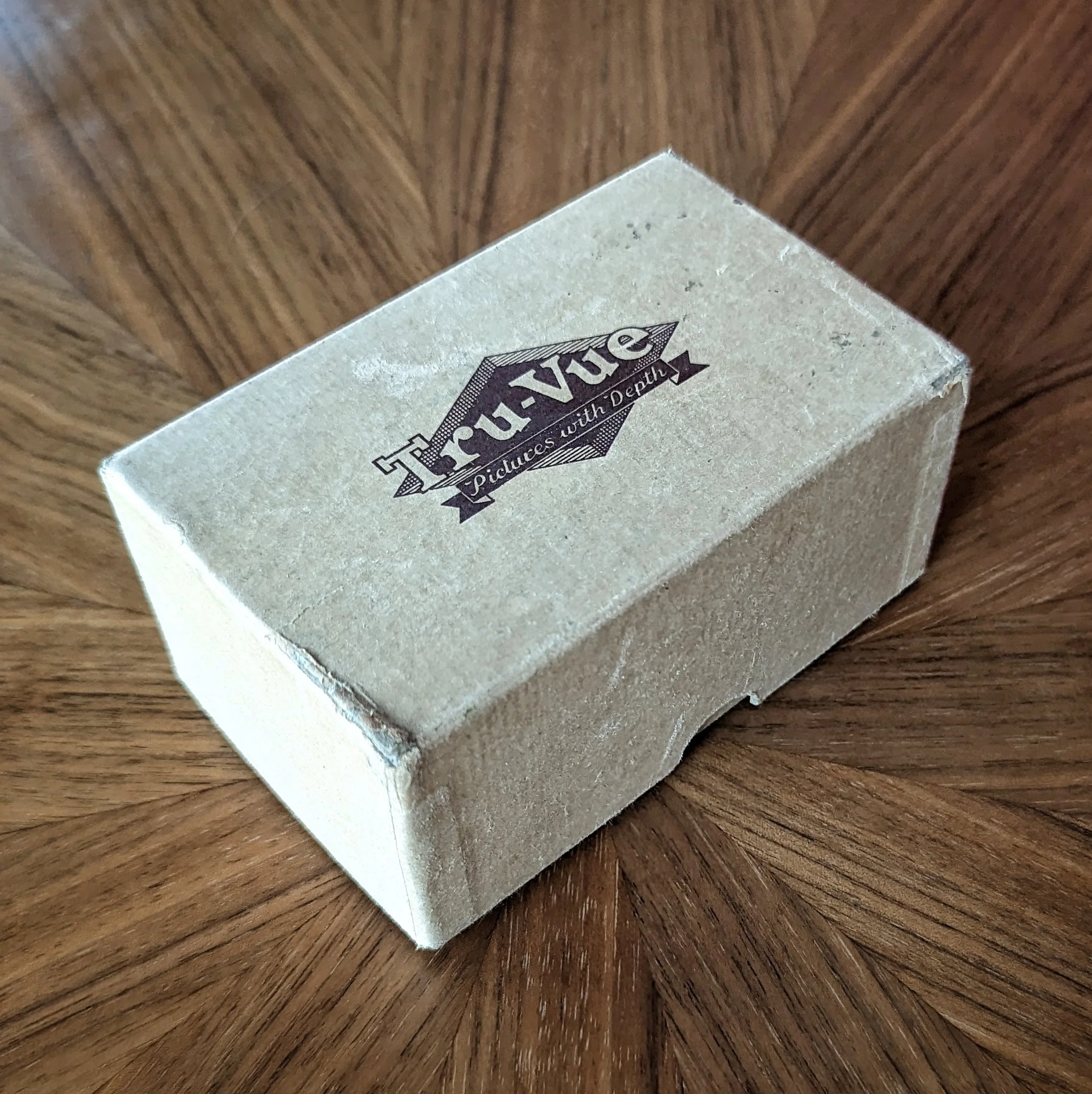
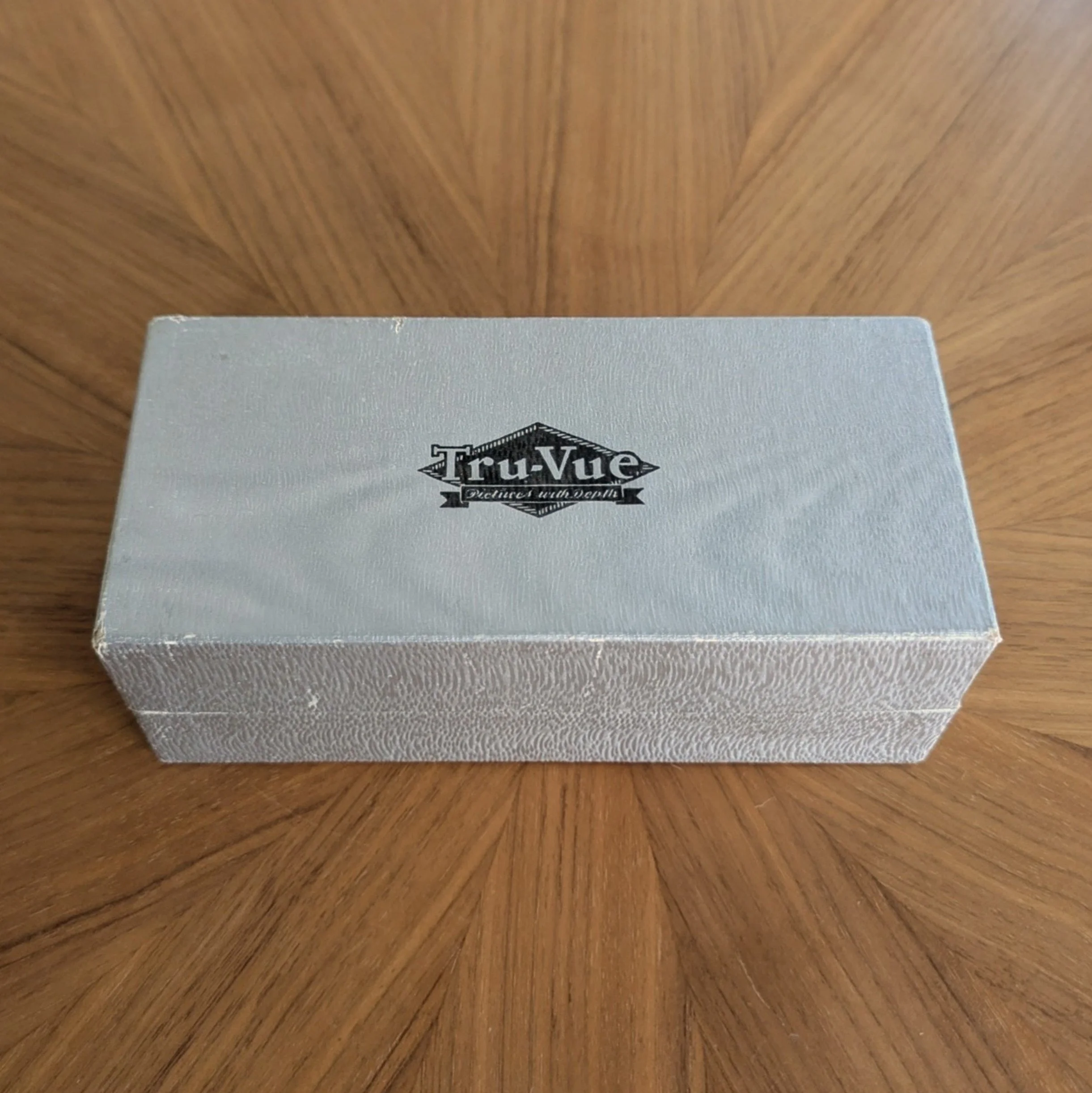
Silver Boxes - Early Logo (~1935)
All the silver boxes we have are two-piece with a black bottom, introduce the slogan “Pictures with Depth,” feature a Tru-Vue graphic logo, and no longer mention Rock Island Bridge & Iron Works. The first silver boxes came in flat silver and silver foil. Both had a shield-type logo.
Silver Foil Box - Later Logo (1936 - 1939)
This box is two-piece with a black bottom and silver foil top but has the diamond-and-banner Tru-Vue logo.
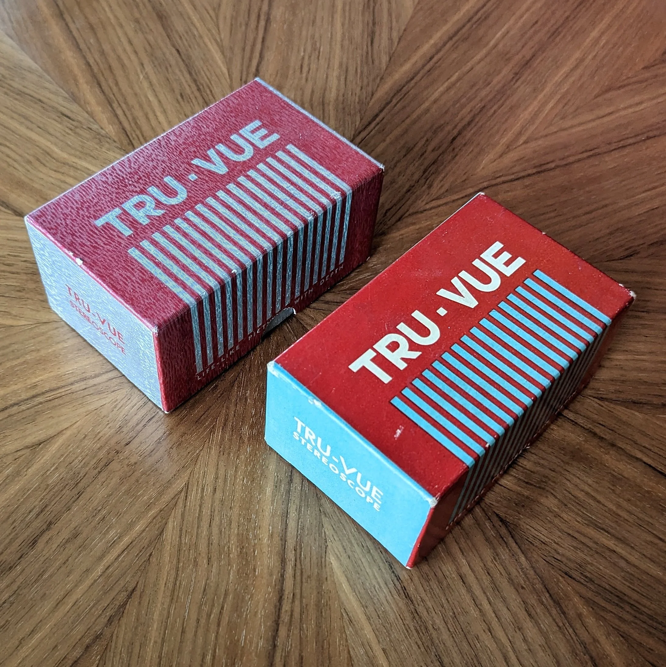
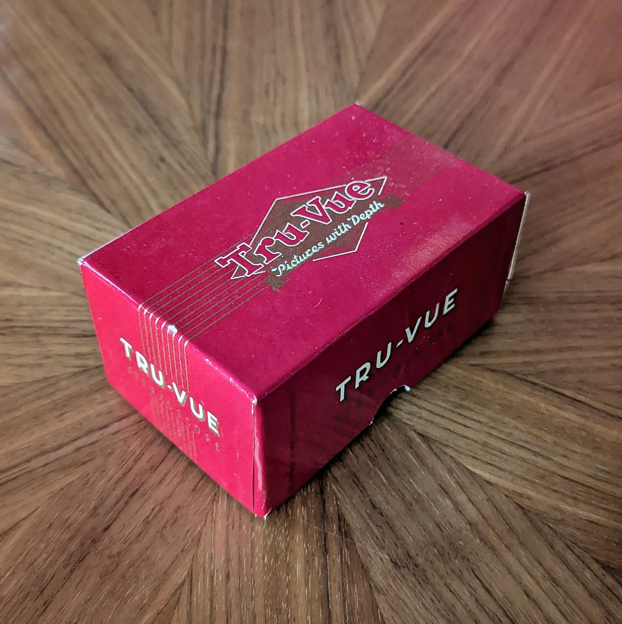
Red Piano Box (1939 - 1947)
These two-piece boxes were made for the newer streamlined Tru-Vue viewers. They’re called “piano” boxes because of the stripes that somewhat resemble the keys of a piano. They coincided with the use of the striped “piano” film boxes. These boxes do not have a graphic logo, and they have the word “stereoscope” and the slightly different slogan “Life-Like Pictures with Depth.” We have two versions:
Red and silver foil
Red, light blue, and white flat
Plain Tan Box (1947)
Just a plain cardboard box with the Tru-Vue diamond-and-banner graphic logo.
Red & Gold Glossy Box (1947-1952)
Color Cartoon Box (1952)
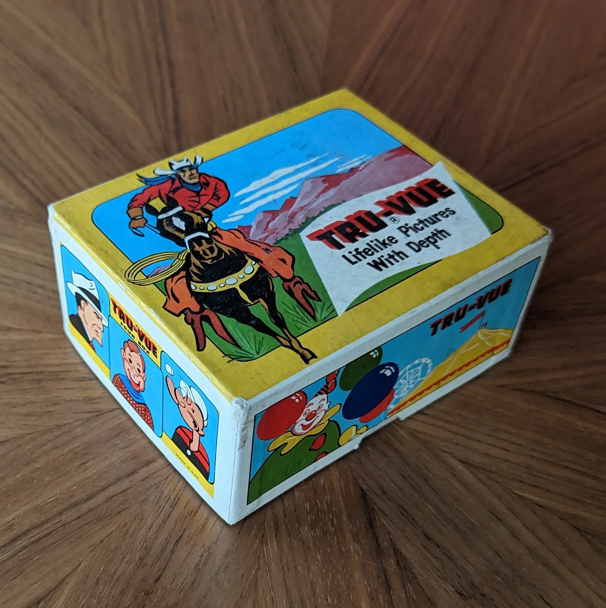
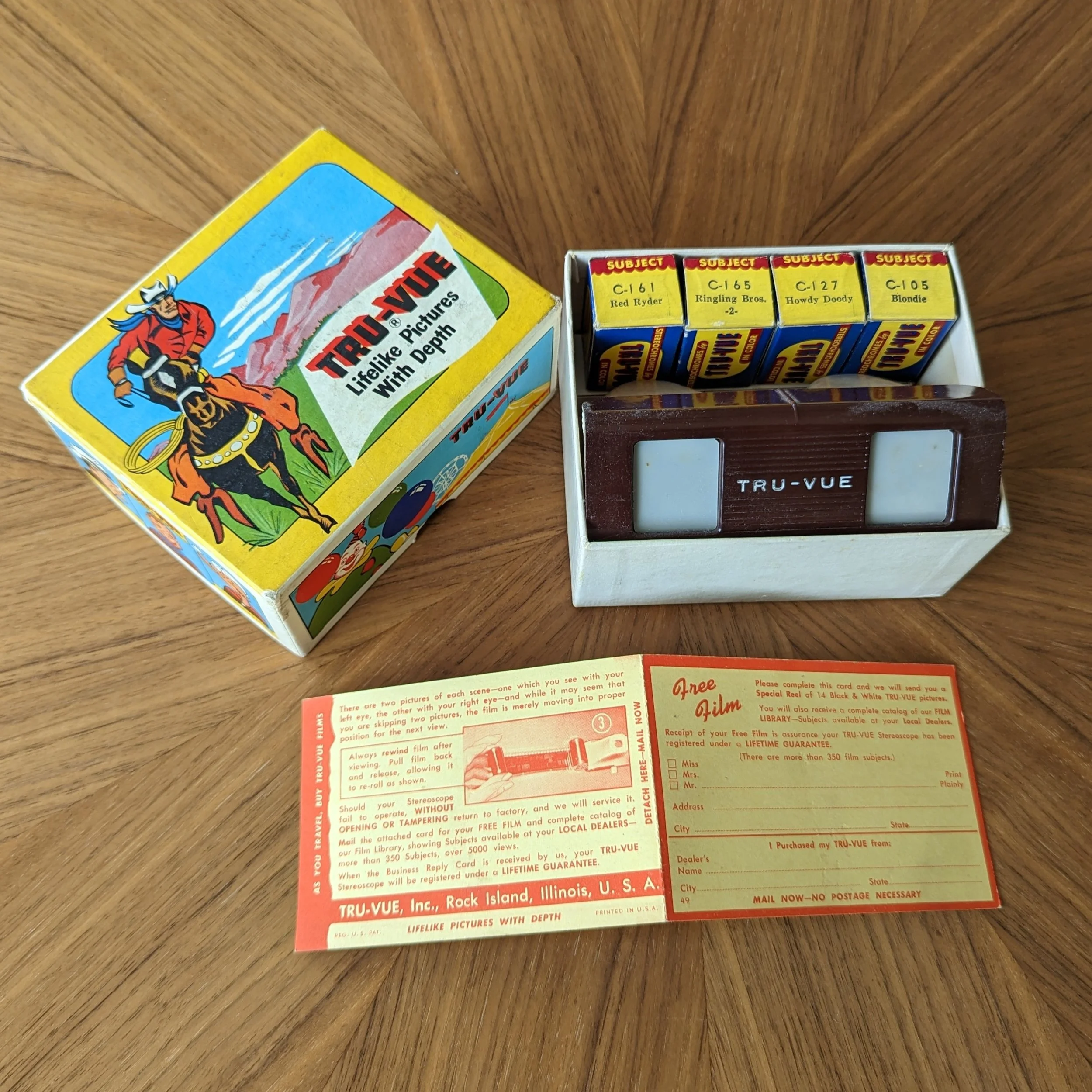
This two-piece box would come with four of Tru-Vue’s color cartoon films and their brown & white streamlined viewer. The box features images of some of the film characters: Dick Tracy, Howdy Doody, Popeye, etc.
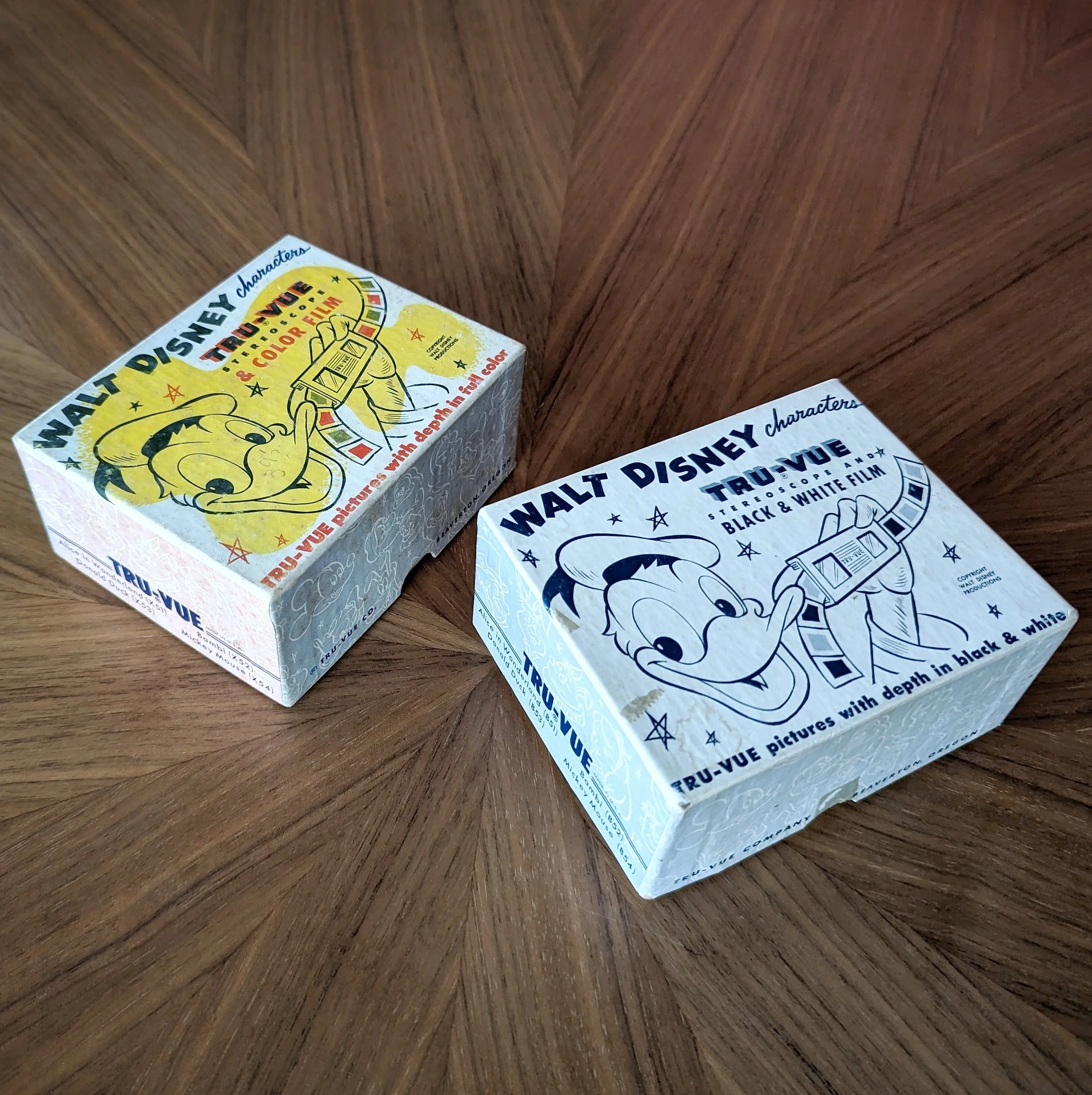
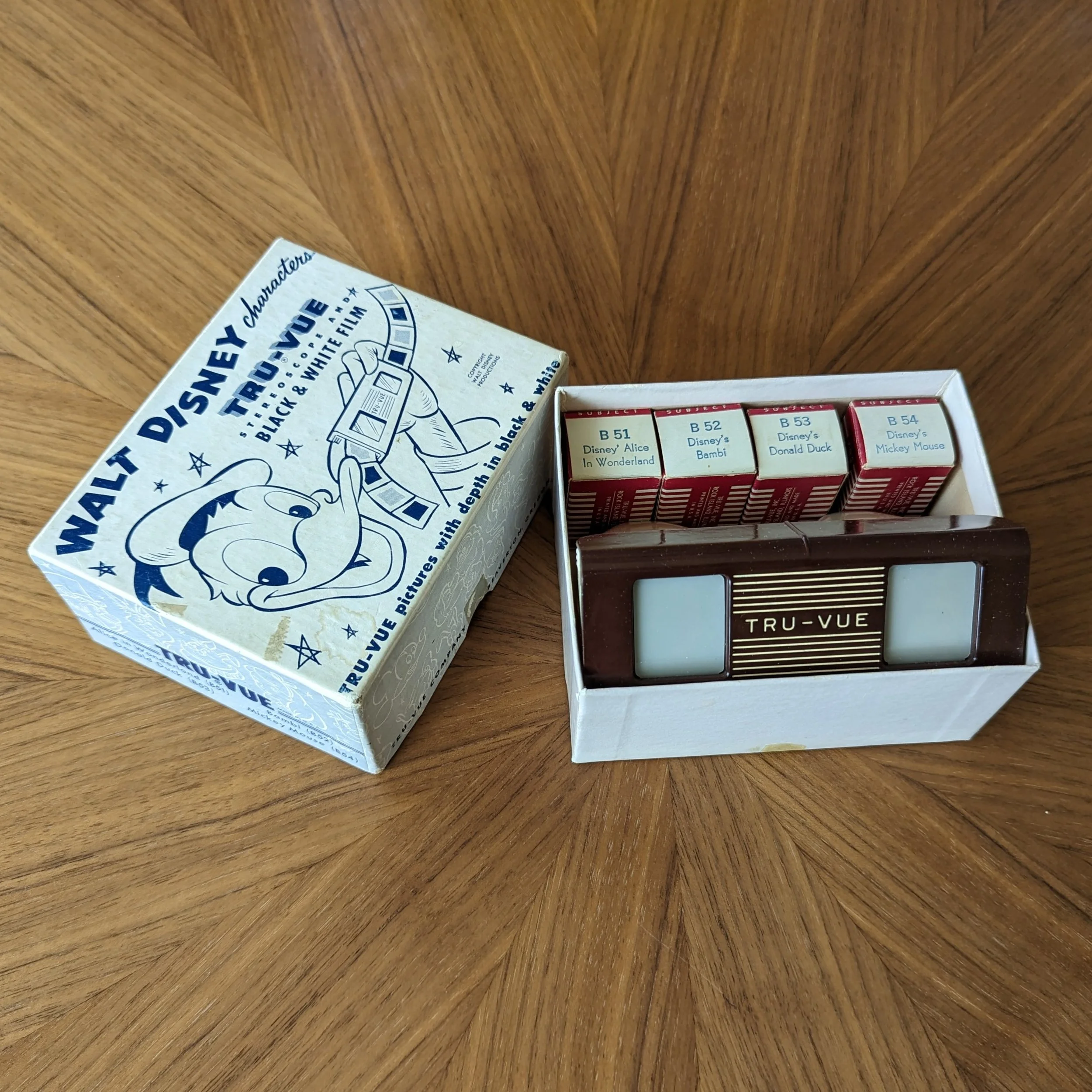
Disney Box (1952)
Tru-Vue makes use of its Disney copyright with these boxed sets. The two-piece boxes are similar — both have a Donald Duck face featured prominently on top and fun Disney characters on the sides. Also, the majority of the box text is the same. The one containing the color film appropriately has the colorful box.

Long “Three-Box” (1949)
These two-piece boxes were slimmer and longer than earlier Tru-Vue boxes. They could comfortably fit a viewer and three boxes of film to the side of the viewer, hence the name “three-box.” We have this box style in two color combinations: red / light blue and gold / black.
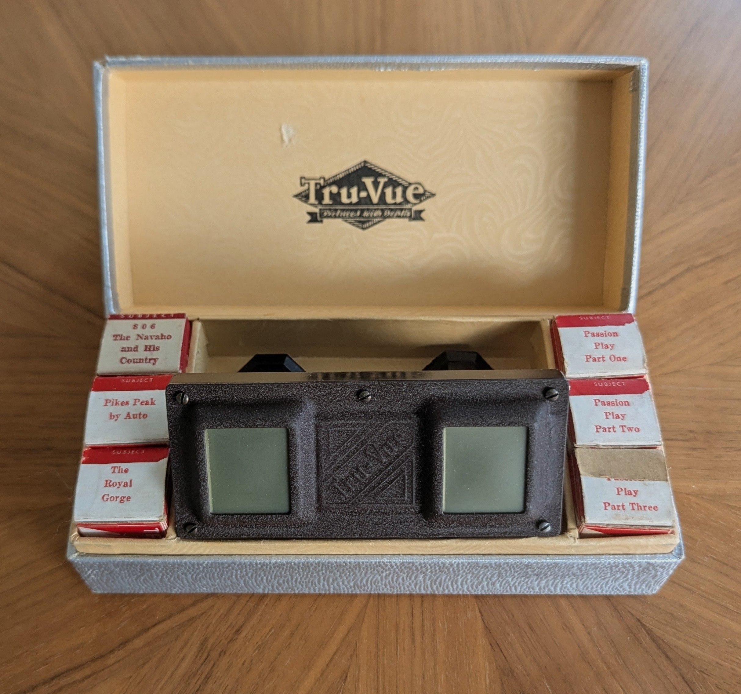
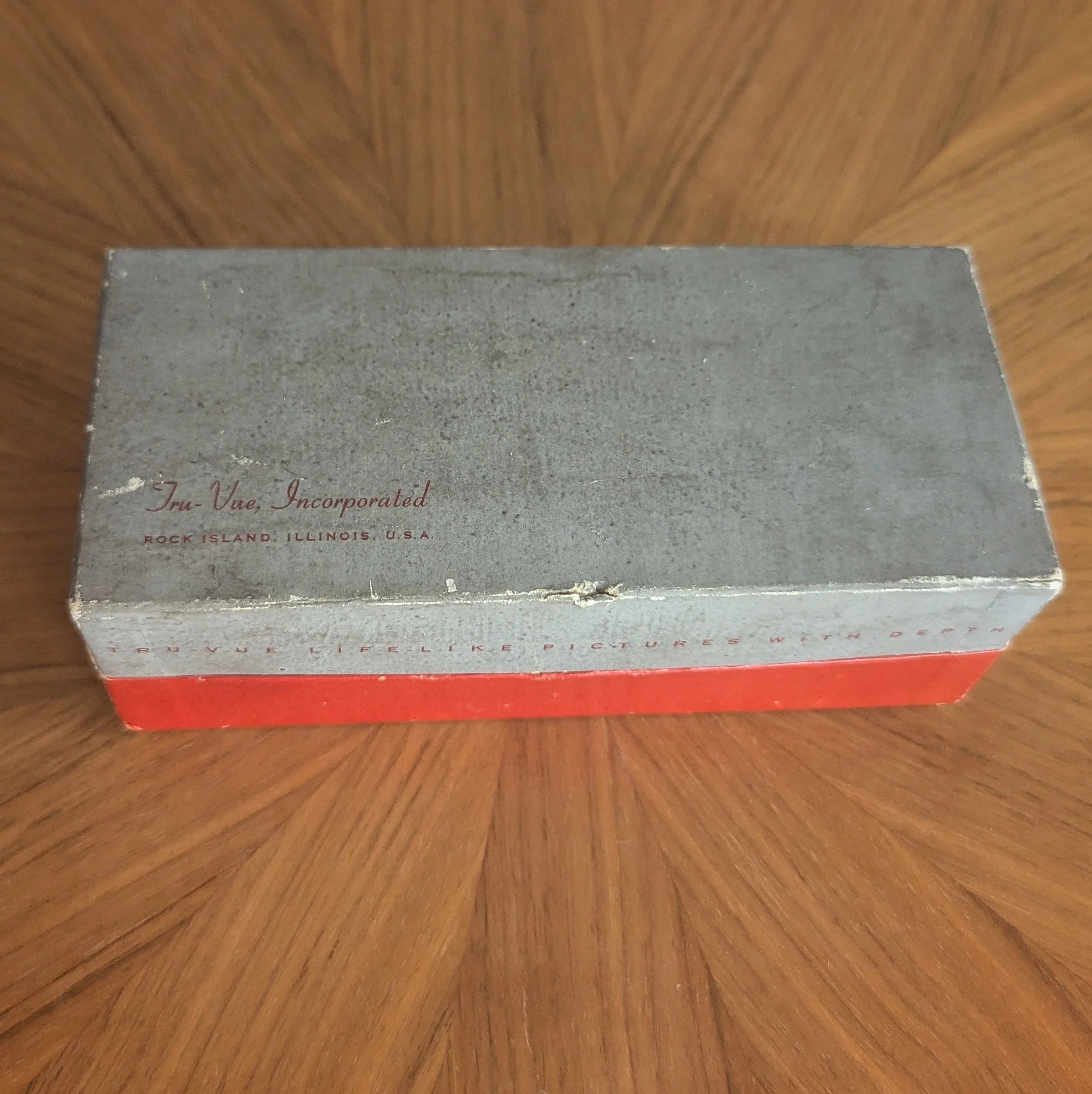
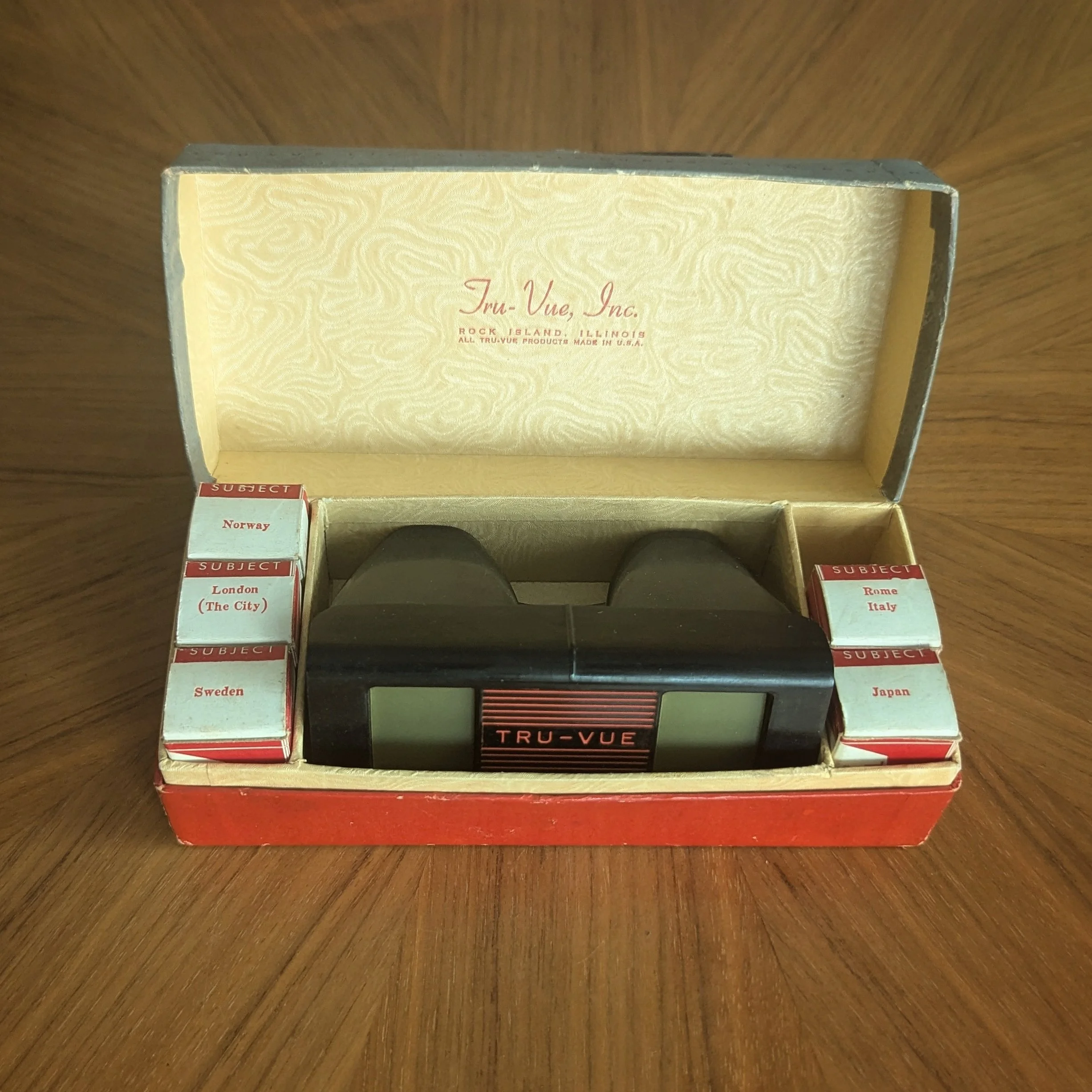
Long “Six Box”
The standard “six box” is a one-piece hinged box and is similar to the boxes used for their Fred Harvey & National Park sets (see our Special Sets page). The box was designed to fit the viewer in the middle and three film boxes on each side. We know of three color combinations:
silver foil
tan top / red bottom - inside this version was a lifetime guarantee notice card as the base with a cutout for the viewer’s advance lever.
gray top / red bottom - this has the Tru-Vue in fancy script with the word “Incorporated” fully spelled out
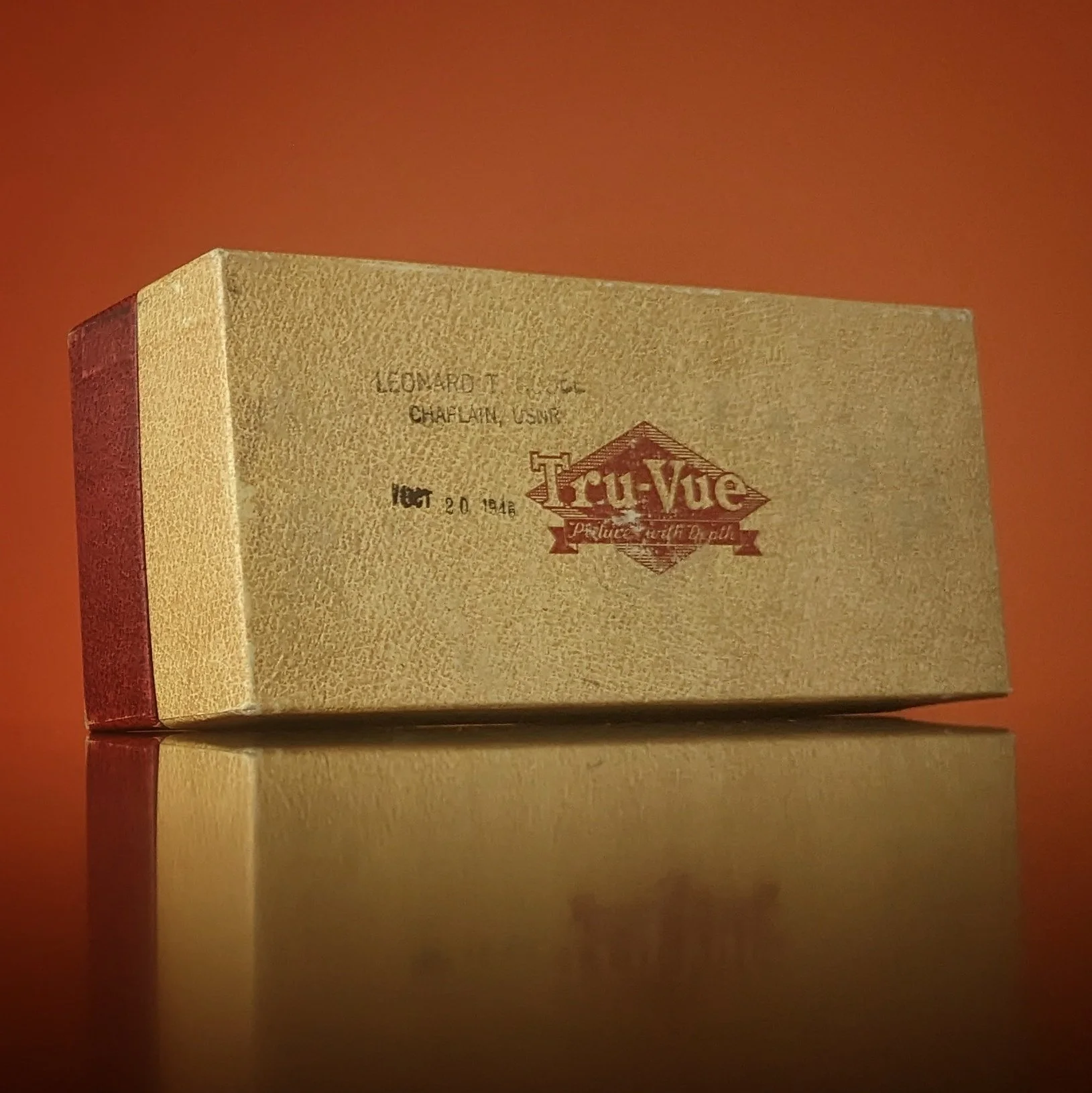
The stamp on top indicates that it was the property of a military chaplain in 1948.
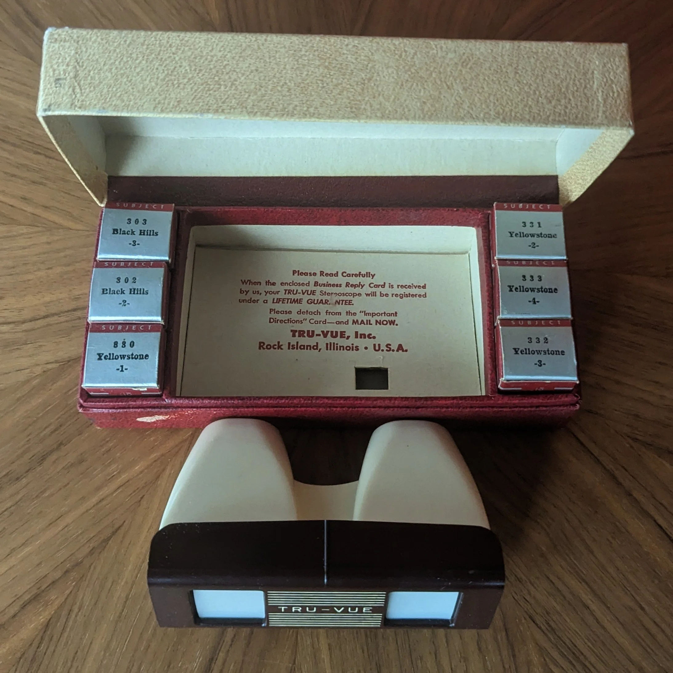
Base of the box has a cut-out hole to accommodate the viewer's advance lever
Sawyer’s Tru-Vue Boxes
These boxes are for the Tru-Vue card viewers that Sawyer’s created after taking over Tru-Vue. These new card viewers were exclusively marketed towards children. The box design features the Tru-Vue name in the new trademarked script font registered by Sawyer’s in March 1952.
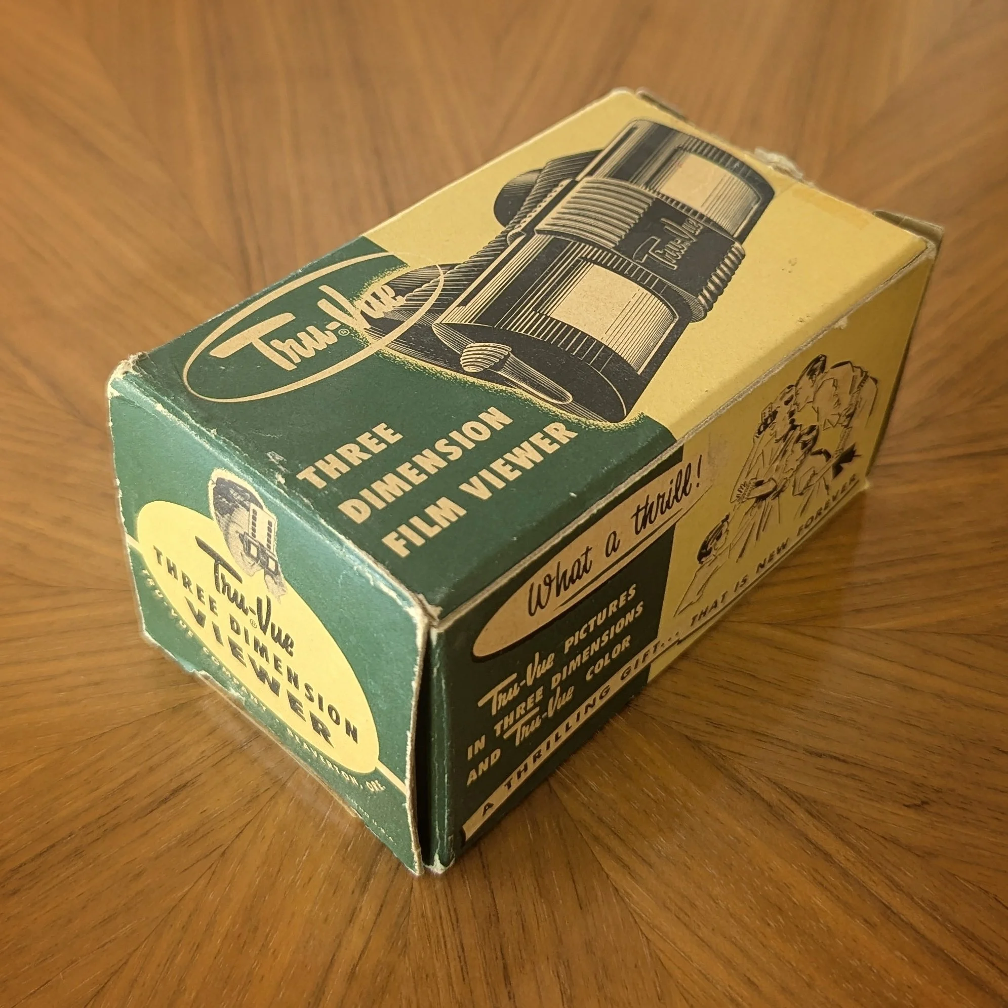
Box for the first Sawyer's Tru-Vue viewer: the Budget viewer
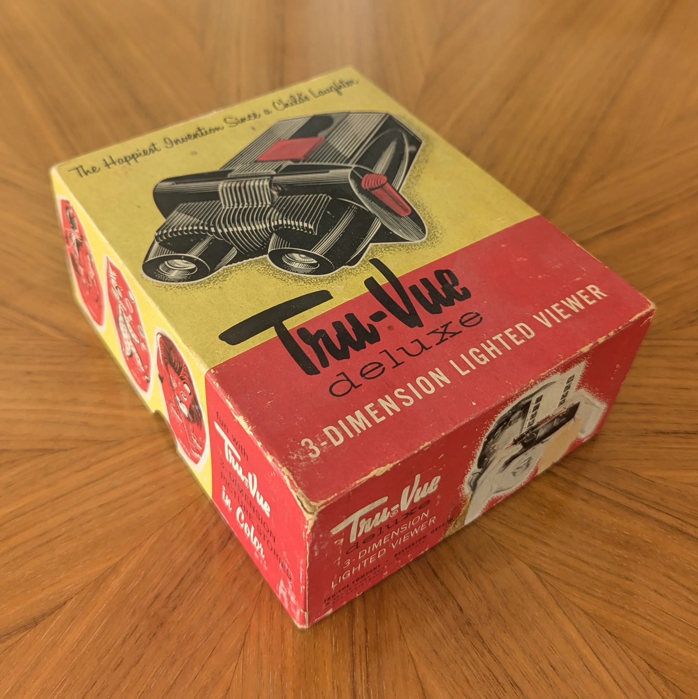
Box for the 2nd Sawyer's Tru-Vue viewer, the lighted "Deluxe"
Gift Set Boxes & Magic Eyes Packaging
Here are a few of Sawyer’s gift boxes, including one for their newest and smallest Tru-Vue viewer, the Junior. The Junior viewer would go on to be packaged in numerous creative ways by both Sawyer and later, GAF, for the Magic Eyes sets.
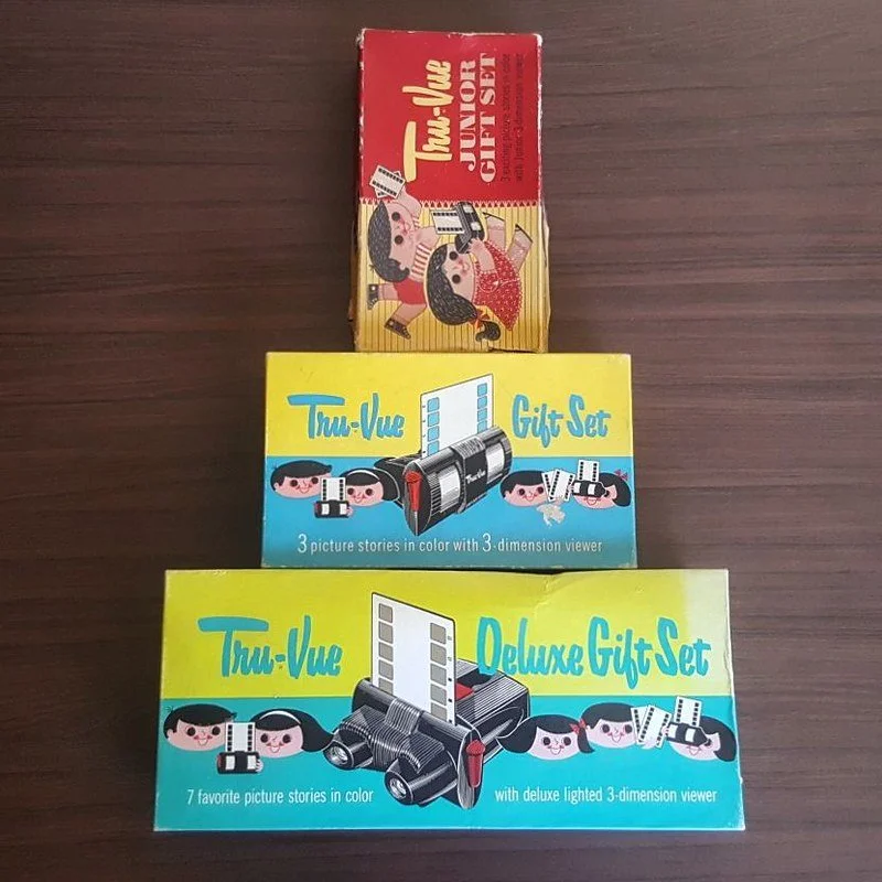
Sawyer's Tru-Vue Gift Sets for the Junior, Budget, and Deluxe viewers
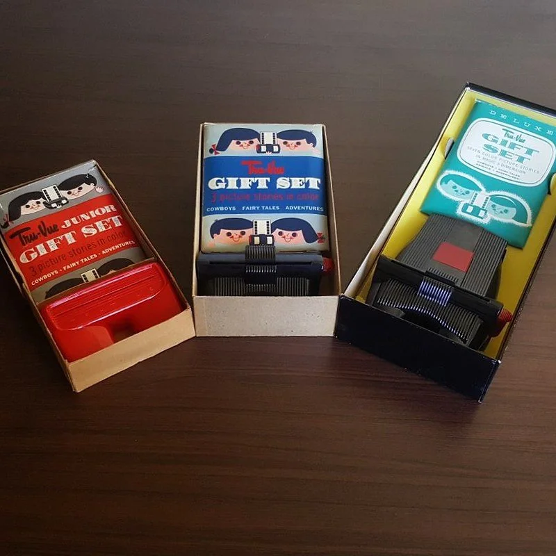
Inside the Sawyer's Tru-Vue boxes
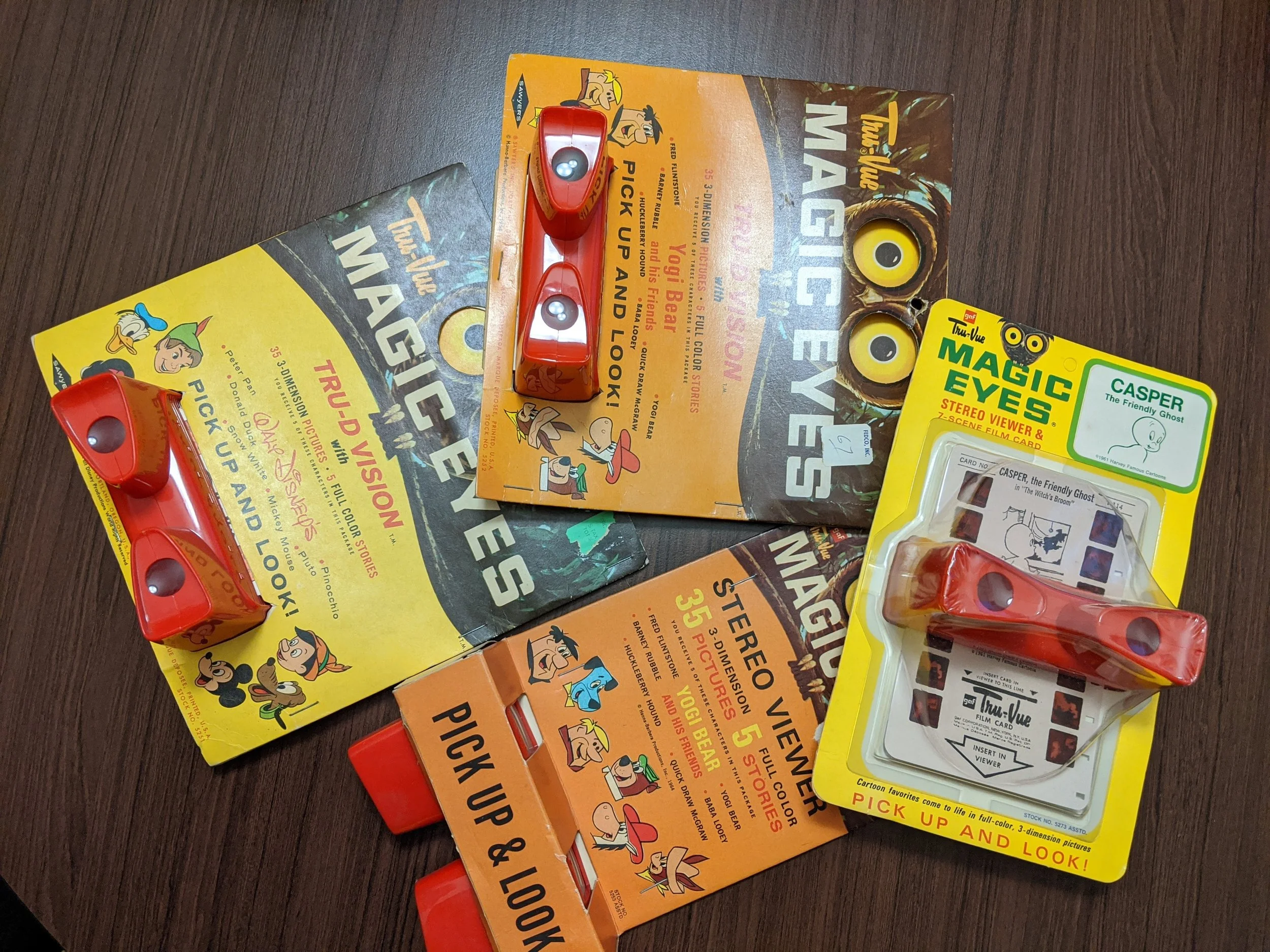
Smallest Junior Tru-Vue packaged in various "pick up and look" styles by both Sawyer and GAF
Continue to explore our Tru-Vue collection:
Tru-Vue Home | History | Viewers | Filmstrips | Cards | Boxes | Cases | Special Sets | Sales & Advertising